Blank mobile first Joomla template with HTML5, SASS and Compass
Every time we start building a Joomla template we use the same code over and over again. That’s why I decided to build a template that’s adaptable to my new workflow of mobile-first design and has all of the necessary tools for building a modern responsive template. You can use and modify the template since it’s hosted on GitHub.
Download the template
Template was tested in Joomla 3.0.3.
Where to begin
When building a website with this template you should think mobile first. What that means is that we start building a website at the mobile width and write the code in the partial files inside the sass/includes directory, which then get compiled with SASS and Compass to the screen.css file. We can add more partials if we need them.
When we increase the width of the viewport we start to use the enhanced.scss file. The file gets read by the IE browsers that have the version IE8 and bellow excluding IE mobile. The style is included with an IE conditional statement, so it only applies to the specified browser. For all other browsers you use media queries.
The template unsets all of the core libraries (mootols, jQuery and Twitter bootstrap). After the installation go to the template settings and pick the libraries that you need. For now there is no option to use Twitter Bootstrap.
Template options

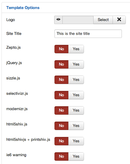
Under template options you can choose a logo image or display the Site Title. We can also pick some of the libraries that we need. By default they are all set to No, maybe you’ll have a project where everything will be done in pure JavaScript. If you position the mouse over the title of the script you get a more detailed description of what each library does. There is also an IE6 warning message that can get included if someone visits the website with the browser.
IE conditional statements

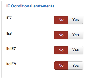
If we want to have specific stylesheets for Internet Explorer we can enable them here, they get included with IE conditional statements. The specific scss files are empty so if we enable them here we have to also write some css code. Most of the themes now use modernizer for injecting the styles into the html, but if we need a small fix just for one IE version this option is better and smaller.
Apple touch icons

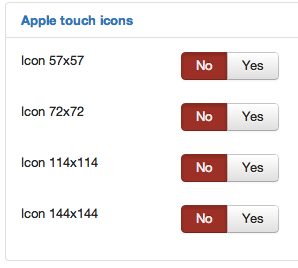
We can enable the links to the touch icons. I created the icons with the iOS App Icon Template. It’s a Photoshop file where you edit smart layers and then export the icons with the actions provided. The icons are located in the template/images/icons folder. Create and replace them with the existing ones. The icon link gets injected into the head of the document.
HTML structure of the template
<!-- After the head -->
<body itemscope itemtype="http://schema.org/WebPage">
 <header>
  <h1 id="logo">
   <a href="#">This is the site title</a>
  </h1>
 </header>
 <nav>
 </nav>
 <div class="wrapper">
  <aside id="left-sidebar"></aside>
  <section id="content">
   <div class="breadcrumbs" itemprop="breadcrumb"></div>
   <!-- Here comes the content -->
  </section>
  <aside id="right-sidebar"></aside>
 </div><!-- end .wrapper -->
</body>
The structure is very basic. There is also a logic for the sidebars, if there is 1 sidebar or none, the content area stretches to the full width. We can specify the width of the sidebars in the variables.scss file.
Questions or issues?
If you have any issues with the template please use the GitHub issues tracker. For question feel free to ask in the comments bellow.
The template will change over time, depending on the needs, this is just the beginning.